You want people to visit your website. Maybe you want them to buy your stuff. Maybe you want them to join a mailing list. To accomplish your goal (whatever it may be), you need to advertise. You might advertise on social media or use PPC ads, or do something else entirely.
No matter which method of advertising you use, if it’s online advertising, someone is going to click a link, and that link will take them to a page on your website.
That page is what we call a landing page – and the strength of your landing page will determine your conversion rate. In this article, we’re going to analyze what landing pages are aiming to do – and how you can build better landing pages to improve conversion rates.
Let’s hit the ground running and get into the meat of things right away.
What is a landing page?
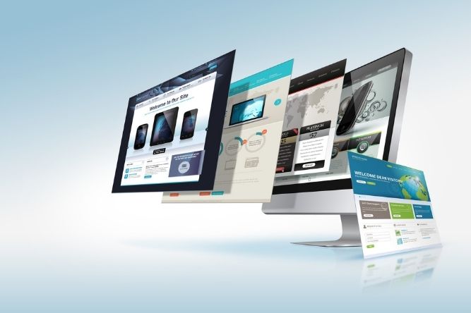
You can think of a landing page as any page that is linked to a marketing campaign. We can be a bit more specific, though: A landing page is any page that is otherwise separate from the rest of your website, and that specifically serves the purpose of improving the conversion rate of an online marketing campaign.
Let’s dive deeper.
Keep conversion in mind
The simple goal of any landing page is getting the person who landed on the page to perform whatever action you want them to, be it buying a product or filling out a form.
The average conversion rate of a landing page varies substantially from industry to industry – average rates vary from around 2.6% to around 6.1%. Of course, our goal is to do better than average – but even a 4-5% conversion rate can lead to a very successful marketing campaign.
When we design our landing pages, we must keep the goal of having a high conversion rate in mind. Landing pages are made to move your customers through the sales funnel.
What is the purpose of your landing page?
Is your goal to grow brand awareness? Are you looking to sell return customers on a new product? Are you trying to grow your leads? It’s important to keep your conversion goal in mind when designing your landing page – it’s a key piece in a broader marketing strategy. Keep the landing page cohesive with the rest of the project, and make sure all visual and textual elements support your goal.
Making a great impression
With conversions and a cohesive campaign in mind, a landing page must make an immediate, positive impression. Much of our copy will revolve around highlighting the reasons your brand is special and the benefits of following through on the call to action (CTA). As you’ll see in the next section, the elements of our landing page all serve this goal.
Using analytics to your advantage
Here’s something you won’t see on any landing page – there are analytics being gathered in the background. A great landing page will use these analytics for something akin to self-improvement. Analytics will tell us what works and what doesn’t – and we’ll be able to improve our landing pages from there.
What elements make for a great landing page?
Now that we know what a landing page is and what we’re trying to accomplish with our landing pages, we can look at the individual elements that make a great landing page stand out – and convert.
Your unique selling proposition (USP)
Your USP is what makes your product or brand special. Why should a potential customer join your mailing list when their inbox is already full of spam? Why should they buy a pair of shoes from you when they could buy shoes from Nike?
Only you know what your USP is. Maybe your shoes are higher quality, or less expensive, or made ethically. Maybe your mailing list comes with steep discounts, exclusive offers, or incredibly engaging content.
Whatever your USP is, your copy is going to support it.
Your main and supporting headlines
Your main headline is going to directly state your USP. Our ethical shoemaker might have a headline like “Better shoes. For a better world.” For a mailing list, we might say “Want free stuff? Join our mailing list”.
Short and sweet.
Supporting headlines should be almost as short as the main headlines and support the claims made about your USP. They can also list benefits – the advantages the would-be customer will enjoy by accepting your CTA.
A supporting headline for our ethical shoemaker might read: “Our comfortable shoes are made here in North America by workers making a living wage – so your heart can feel as good as your feet”.
Our mailing list, on the other hand, could have a supporting headline like “We’ll never send you spam – only deep discounts so you can buy more of what you love”.
Reinforcing your USP
There are a number of ways you’ll reinforce your USP, and we’ll look at many of them when we discuss visuals and social proofs. Text reinforcement should be kept brief – it should only supply essential, positive information (features) and benefits. You don’t need paragraphs – keep things brief! If you’re providing a low-cost alternative to your competitors, consider using prices to reinforce your USP.
A great CTA
Your CTA should be visible immediately when your landing page loads. A customer should be able to click “Buy now” or fill in a form right away. If your customer has scrolled towards the bottom of the page, it means they’re still considering your CTA – save a great bit of copy for the end of your page, and follow it up with one final CTA. You might also consider a CTA in the middle of your landing page if it’s getting long.
Keep things interesting with visual elements
A wall of text is intimidating. Visuals are fun and inviting. Visuals can also provide information density – you can provide your customers with more information using less space. We’re going to take advantage of this – landing pages should be highly visual.
From zero image to hero image
The first step is creating a hero image – a big, beautiful image that will take up most of your landing page “above the fold” (content that appears in the device screen before scrolling down). Some industries have also found hero videos useful – short clips to encourage customers to follow through on the CTA. The hero image should, if possible, be a visual representation of your USP.
Establishing trust with visuals
People don’t trust walls of text. They do, however, trust infographics. Our brains absorb visual information very quickly – they also help with our short attention spans. By using graphics, images, videos, and limited textual elements accompanying these things, your user will trust you more. They’ll also better retain the content on the page!
Keep free of clutter
Users don’t trust clutter – why is your landing page disorganized? Keep things simple and sleek.
Entice your customer to follow your call-to-action
Everything we’ve done so far has been in service of this goal – getting the user to follow your CTA. Here are a few more things we can do:
Use social proof
We’ve talked a lot about trust. One way to get clients to trust you enough to follow your CTA is by using social proof: Things like reviews, social media posts, or even pictures of real clients can help you establish a trusting relationship with your clients.
Keep forms short
More and more users are accessing the internet on mobile devices. Have you ever tried filling out a form on your smartphone? It’s not an enjoyable experience. Limit your forms to as few fields as possible – when you can, ask for nothing more than an email address and first name.
Improving your landing pages
By now, you’ve got a good idea of what elements a generic landing page should have. Of course, that won’t tell you how your specific landing page should look – and for that, you’ll need to do a little testing.
Use analytics to your advantage
The analytics available for landing pages are incredible – especially if you’re running PPC ads. You can determine the demographics that are clicking on your links and who among those demographics are actually converting. We can use that to customize landing pages for each of your customer personas, for each different ad you’re running, for the platforms you’re running ads on, and more.
A/B and multivariate testing
Not sure whether your hero image should be right-aligned, center-aligned, or left-aligned? Not sure whether you should use the purple or pink product image? Have a couple of pieces of copy in mind for your main and supporting headlines?
Test each configuration out. Use different links for the same campaign, and determine which demographics respond best to different landing pages. This will help you find the perfect landing page or tailor it for other sites and demographics.
Landing on the perfect page
With this information by your side, you should be making incredible landing pages in no time. Getting a landing page right can take a lot of time and effort, however, and if you’re running a large campaign, it can be pretty daunting.
That’s where we come in. We offer a wide variety of web marketing services, including San Antonio SEO, social media marketing, PPC ads, and, of course, building and optimizing landing pages for your digital marketing campaigns.
Interested in our services? Give us a call! Trust us – you’ve landed on the right company.


Recent Comments